How to Effectively Find the Interquartile Range (IQR) in 2025: A Step-by-Step Guide
The interquartile range, commonly referred to as the IQR, is an essential measure of statistical variability that provides insights into data distribution. Understanding how to **calculate the interquartile range** allows researchers and analysts to assess the **spread of data** effectively. This guide will teach you how to find IQR step-by-step, ensuring a clear understanding of quartiles, their calculation, and their application in **statistical analysis**.
Understanding the Basics of Quartiles
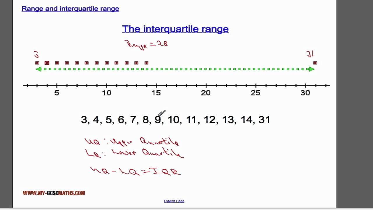
Quartiles divide a data set into four equal parts, making it easier to analyze different segments of data. The first quartile (Q1) marks the point below which 25% of the data fall, while the third quartile (Q3) indicates the cutoff below which 75% of the data reside. The difference between these two quartiles gives us the **interquartile range (IQR)**, which effectively represents the **range of the middle 50%** of data. Understanding these concepts is pivotal in data **interpretation** and statistical analysis.
Calculating Q1 and Q3
To calculate Q1 and Q3 effectively, first arrange your data set in ascending order. Once organized, locate Q1 and Q3 as follows:
– **Q1** is found by identifying the median of the lower half of the data (not including the median if the total number of data points is odd).
– **Q3** is found by calculating the median of the upper half of the data set.
These quartile calculations will be crucial for determining the IQR.
The Interquartile Range Formula
The formula for the interquartile range is straightforward:
IQR = Q3 – Q1.
By subtracting the first quartile from the third gives you a quantitative measure of variance in your data. This measure is particularly important in identifying **outliers**, as values that fall outside of 1.5 times the IQR above Q3 or below Q1 can be flagged as partly affected by **outlier detection** in exploratory data analysis.
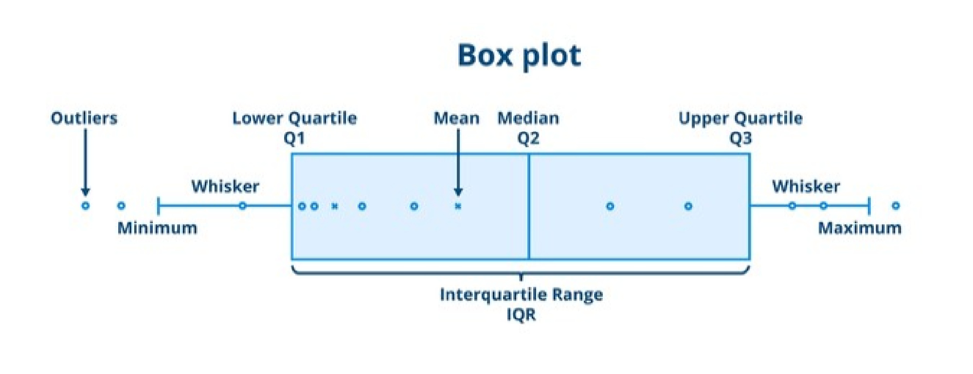
Visualizing Data with Box Plots
A box plot is a valuable graphical representation of the interquartile range. This visualization allows you to easily see the median, quartiles, and any potential outliers. In a box plot, the IQR is represented by the length of the box, with Q1 at the lower end and Q3 at the upper end. This graphical representation is vital for understanding how data is spread out and managing the **data presentation techniques** involved in comparative analysis.
The Importance of IQR in Statistical Analysis
In statistics, the IQR is critical for measuring data variability and assessing **data consistency**. By focusing on the interquartile range, analysts can effectively reduce the impact of outliers and construct a clearer picture of data trends without letting extreme values skew the results. The significance of the interquartile range lies in its ability to summarize large data sets while allowing researchers to understand the **distribution shape** effectively and ensure robust conclusions.
Identifying Outliers
One of the primary applications of the IQR is in **outlier detection**. To identify outliers, multiply the IQR by 1.5, adding this value to Q3 and subtracting it from Q1. Any data point outside of these bounds may be considered an outlier. For example, if your IQR is 20, then potential outliers can be calculated by determining the values of:
– Upper Bound: Q3 + (1.5 * IQR)
– Lower Bound: Q1 – (1.5 * IQR)
This proactive approach helps maintain a clean data set, benefiting further *data analysis techniques*.
Real-Life Examples of IQR Usage
The interquartile range is applied across numerous fields such as finance, academic assessments, and scientific research. In a typical educational context, the IQR can help educators measure variability in student scores for assessments. For example, say a school’s test results yield quartile values of Q1 = 70 and Q3 = 85. The IQR is:
IQR = 85 – 70 = 15
This indicates that the middle 50% of students scored between 70 and 85, providing educators insight into performance consistency.
Practical Steps to Calculate the IQR
Calculating the IQR can be straightforward if you adhere to a systematic approach, ensuring accurate analysis in statistical methods. Follow these steps for a comprehensive understanding:
Step 1: Organize Your Data Set
First, gather all your data and ensure it’s sorted in ascending order. Accurate data entry is vital, as any errors can lead to misleading results in your **data summary** and affect the analysis outcome.
Step 2: Determine Q1 and Q3
With your sorted data, find the first and third quartiles:
– For Q1, calculate the median of the lower half of the data.
– For Q3, calculate the median of the upper half of the data.
Proper **quartile calculation** is crucial as these figures are foundational to understanding the overall **data distribution**.
Step 3: Use the IQR Formula
Once you have Q1 and Q3, apply the IQR formula mentioned earlier:
IQR = Q3 – Q1.
This calculation provides crucial insights into the middle tendency of your data over the range of the middle 50%.
Key Takeaways
- The IQR is a significant measure of variability, highlighting the **spread of data**.
- Quartiles divide your data into four equal parts; knowing how to calculate Q1 and Q3 is fundamental.
- A box plot is an effective way to visualize IQR for understanding data distribution.
- The IQR aids in outlier detection and helps maintain data analysis integrity.
- Following systematic steps to find IQR can lead to more effective data interpretation.
FAQ
1. How do I find quartiles in a given data set?
To find quartiles, first arrange your data in ascending order. Then, locate Q1 by identifying the median of the lower half of your data and Q3 as the median of the upper half. This method forms the basis for any **quartile calculation** you perform.
2. What does the interquartile range indicate?
The interquartile range indicates the variability or spread of the middle 50% of the data. A smaller IQR suggests that the data points are closely packed, while a larger IQR indicates that the data points are more dispersed. Understanding this metric is crucial in **statistical analysis methods**.
3. How do quartiles affect data interpretation?
Quartiles provide valuable tools for interpreting data by allowing analysts to see distributions, trends, and variances within data sets clearly. By summarizing significant features of distributions, like the IQR, statisticians can derive important insights without being misled by outliers.
4. Can IQR be used in quality control processes?
Absolutely! In quality control, the IQR can help in identifying variations in manufacturing processes. By regularly monitoring the IQR, quality managers can quickly detect outliers and establish systematic discrepancies that could affect overall product quality, thus ensuring that the operations remain within expected standards.
5. What are some applications of the IQR?
The IQR has diverse applications, including finance for assessing stock price variability, education for analyzing test performance consistency, and various fields of research where understanding the spread of data can suggest implications for theoretical paradigms or practical applications. Each of these scenarios emphasizes using IQR for maintaining data integrity through effective statistical analysis.
6. Is IQR more reliable than range for measuring variability?
Yes, the IQR is often considered more reliable than the range for measuring variability because it is not affected by extreme values or outliers, which can skew the data dramatically. This makes IQR a robust metric for understanding the central behavior of data within a set.